
In my presentation about Accessibility in Oracle APEX, which you could see this year at Apex Alpe Adria in Maribor or Oracle User Group Norway in Oslo, I mentioned that one possible problem to be aware of is the charts, especially their colours and patterns. I used a slightly extreme method (grayscale) to show how colors can be unrecognizable for people affected by color blindness.
In this article, I will present a few ways to add patterns to your charts if needed.
When unsure if your chart color palette may be a problem for some users, you can use variable tools to verify. One of the tools that I use is the Adobe Color website. It can help you create a color palette in no time and has accessibility tools to ensure your colors will pass the color blindness test.
I will use the default apex chart colors in the Redwood Light theme to show you how to check the colors.
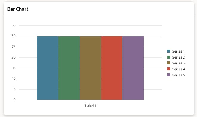
In this example, I have five default colors without any manual altercation. However, when I set the colors in Adobe Color and go to the Accessibility Tools tab, I can see that there may be some problems with the default color set.
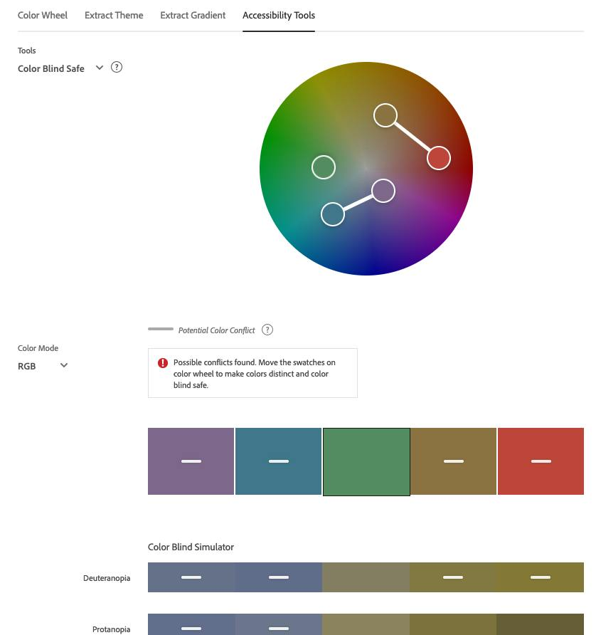
As you can see in the picture above, four colors are marked with a white dash, which means there are possible conflicts with the color distinction.
You can now fiddle with the colors and test the results until they pass all the criteria or add patterns. Let’s look at a few options for how to do this.
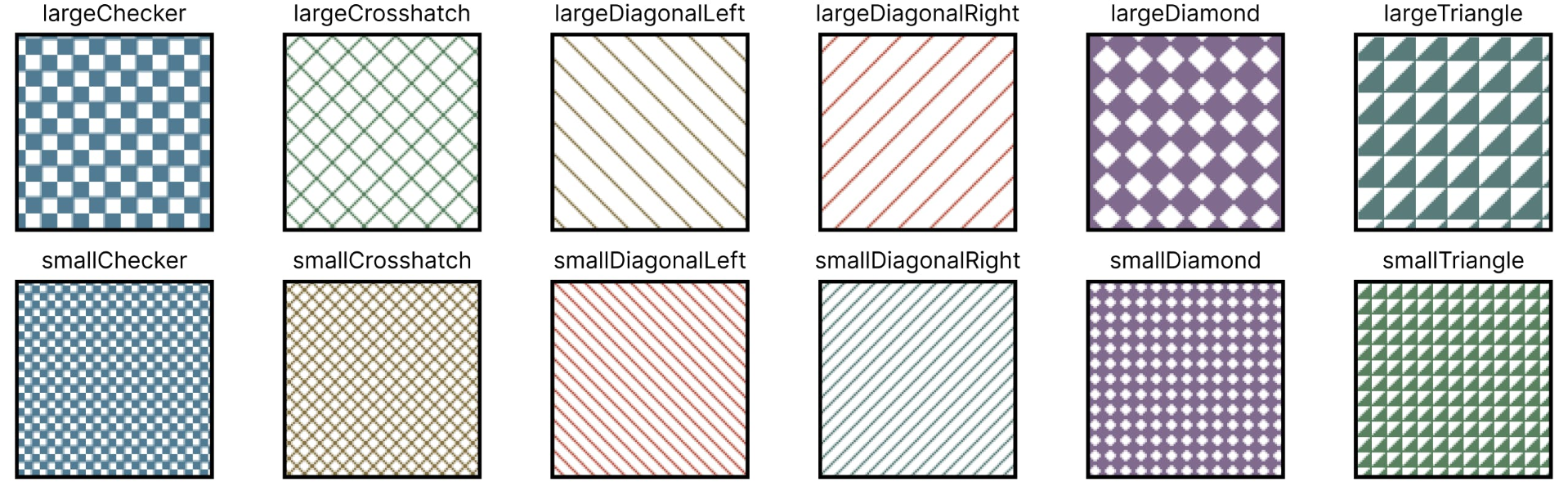
One option you can use to enrich your charts is built-in patterns. If you look into the Oracle JET documentation and look for the word “pattern”, you’ll find a list of patterns available in chart options. The following picture describes the available patterns.
To use the patterns in your charts, you can simply add the options modification into the Initialization JavaScript function in your chart attributes. The function can look like below.
function(options) {
  var listOfPatterns = [
    "largeChecker", "largeCrosshatch", "largeDiagonalLeft", "largeDiagonalRight", "largeDiamond",
    "largeTriangle", "smallChecker", "smallTriangle", "smallCrosshatch", "smallDiagonalLeft",
    "smallDiamond", "smallDiagonalRight", "auto"
  ];
  options.dataFilter = function (data) {
    for (var i = 0; i < data.series.length; i++) {
      var color = data.series[i].color;
      data.series[i].borderColor = color;
      data.series[i].pattern = listOfPatterns[i % listOfPatterns.length];
    }
    return data;
};
return options;
But what if you don’t like the available patterns and want to use different schemes and colors? Thankfully, you can define your own patterns!
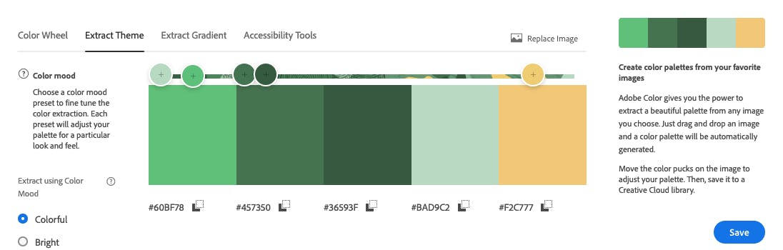
Let’s start with the color palette. I like the new Redwood Light themes in APEX, so let’s use one of the themes and extract the colors from it directly.
I am using the Redwood Light with a Pine accent. When I inspected the colorful bar on top of my region body, I found the actual file representing the pattern. It looks like the image below.
![]()
In Adobe Color, I go to the Extract Theme section and upload my image. After that, it will instantly show me a palette of five colors extracted from the image.
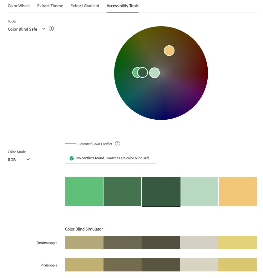
When I check the colors with the Accessibility Tools tab, I can see that there are no problems, and I can go forward with the new color palette.
I meant to use the colors for very subtle patterns, so in the end, I exchanged the lightest green for gray and mixed the yellow to a little darker shade, so it would contrast better with a white background.
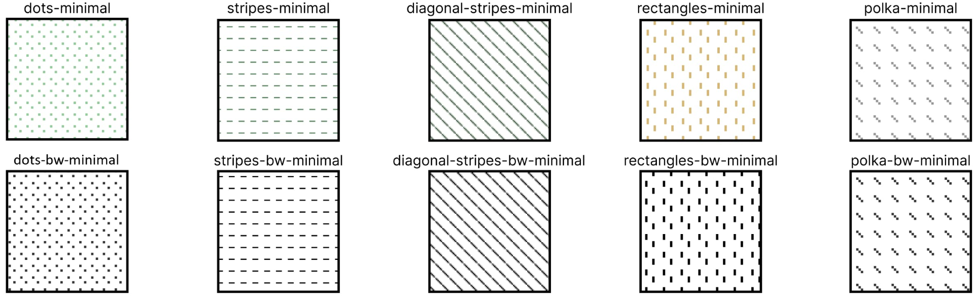
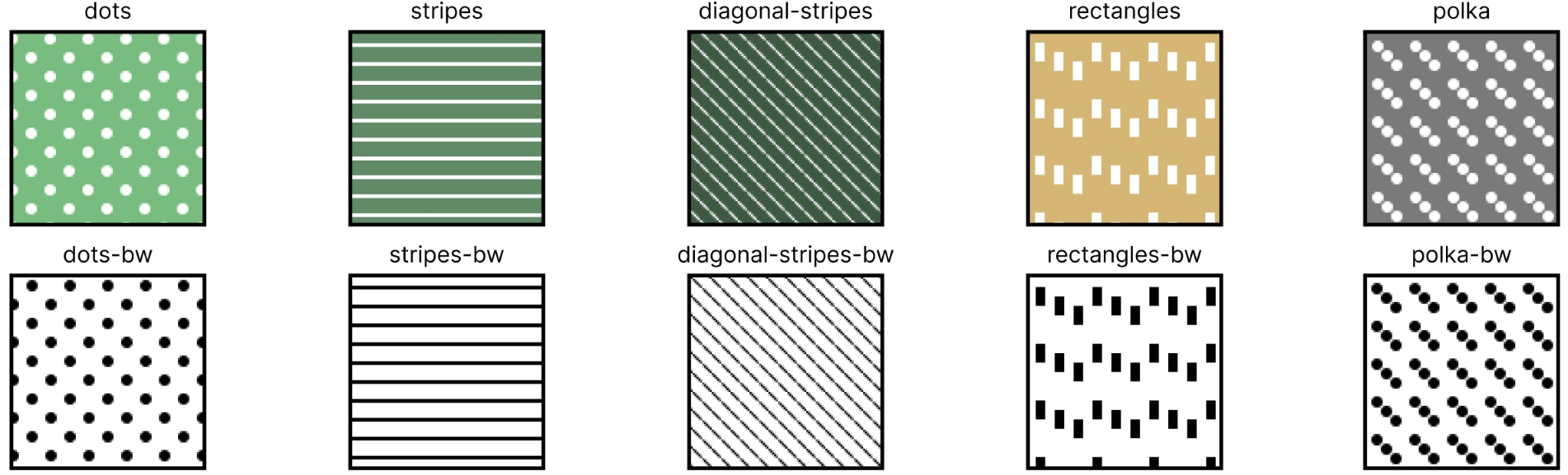
First, I created five patterns with a minimalistic look (I’m providing you with a link to the repository at the end of this article). I also prepared black-and-white versions, as you can see in the picture below.
Then, I modified the size of the patterns and decided to invert the colors – making the backgrounds colorful and the patterns white – to create the next five bolder-looking patterns. You can see them below (I also included B&W versions of the resized patterns).
If that’s not the best option for you, you can create your own patterns… or ask ChatGPT for some inspirations. That’s what I did!
To apply the new styles, download the apex-chart-patterns.js file that contains all the patterns and a few functions that will help you use them. Upload it to Application Static Files and add the file to the File URLs section on your charts page.
Then add the following code to the Initialization JavaScript function section in your chart region attributes.
function(options) {
  //color options are 'minimal-color', 'minimal-bw', 'bold-color', 'bold-bw'
  var newOptions = addPatterns(options,'minimal-color');
  return newOptions;
}
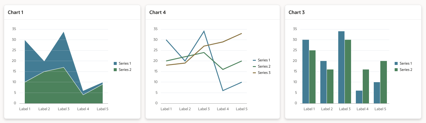
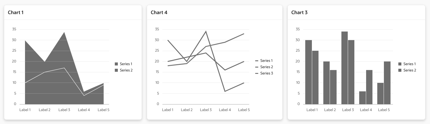
This is what the charts look like with all the previously created patterns:
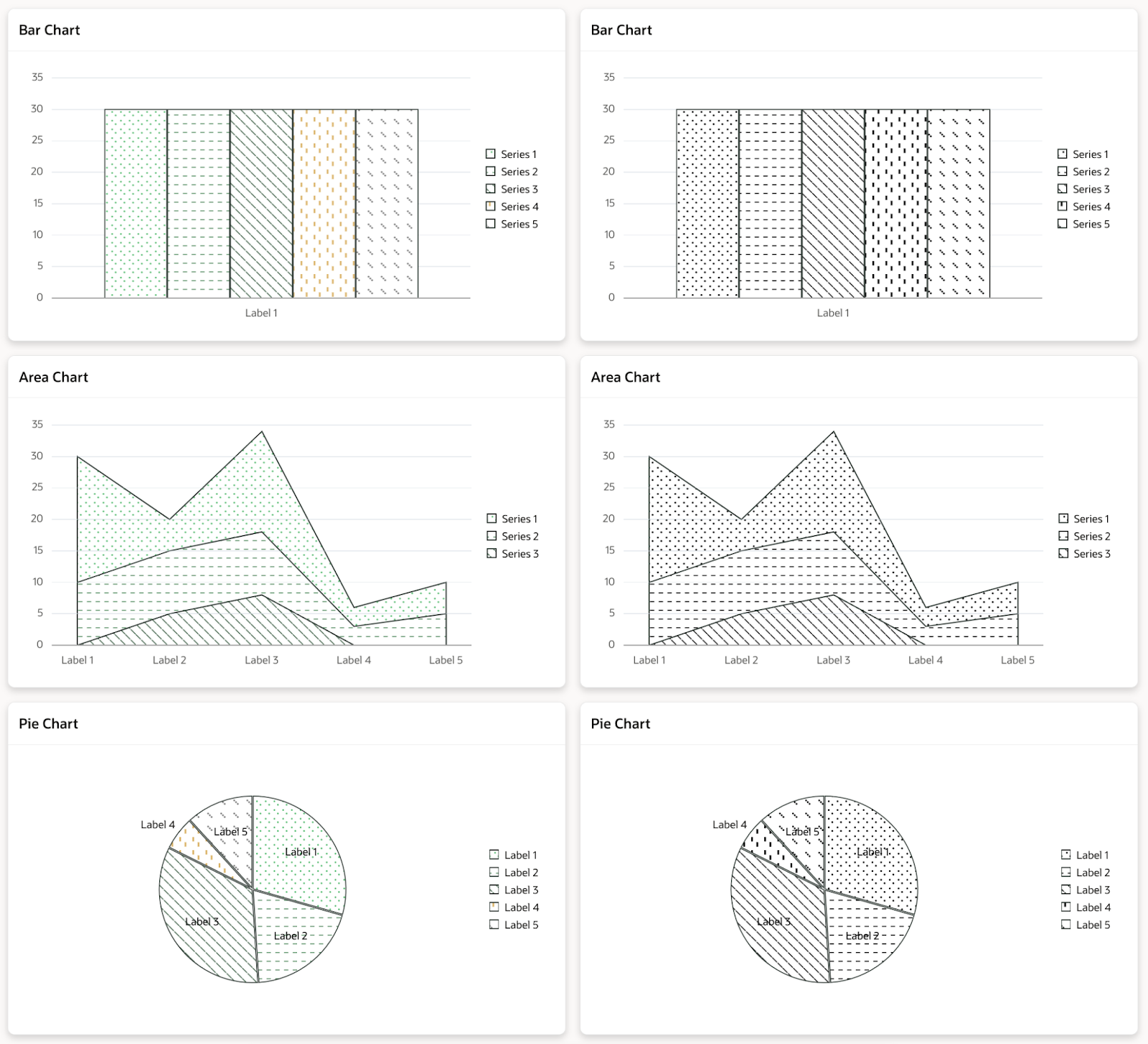
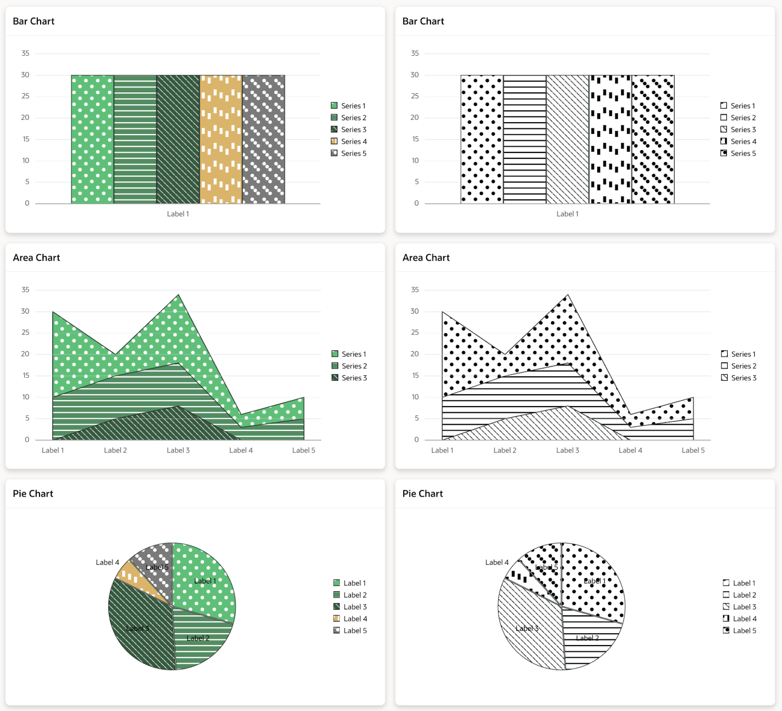
And that’s about it! You can check the charts on your own in the demo application. It’s worth pointing out that there are more options for adding patterns to your charts, and you can also add gradients if you want – my colleague Rafał described how to do it in his article “How to make APEX charts look better using linear gradients”, so check it out if you are interested. You can also read other APEX-related publications on the Pretius blog:


