
In this article I’m sharing detailed instruction (step by step) how to implement bootstrap popover functionality in Oracle APEX classic report.
The plugin is dynamic action plugin implementing nested reports within APEX classic reports. Scope of data, data appearance and behavior is customizable within the plugin attributes.
If it is the first time you read about this plugin, visit live demo application.
In most cases, reporting pages are made of “Master – Details” reports – general data is presented in master report and details can be previewed on another page. But what if business user would rather stay on the same page and is not willing to preview report details in popup or on another page?
Oracle APEX doesn’t support native nested reports. Even if you want to implement it yourself, you have to create separate “on demand” processes to fetch data or custom templates. A lot of stuff to implement just to make one column having nested report. And here comes the plugin.
Imagine the table of customer(s) orders with general data:
To make it more readable you can join customer details such as first name, last name and maybe address. For orders you can count all orders in shopping cart. If you join all ordered products, the report becomes too complicated to read – each product in shopping cart duplicates information that shouldn’t be presented more than once. Probably it would be nice to have details of each row/column in popover. Business user clicks on the column “Customer” and detailed information about the customer appears without reloading the page.
You need a report showing general data of something. In this example I will show you implementation of the plugin within report of orders described above (same as in demo application).
If you want to recreate every step in this article you need model & data. You can create it by installing Sample Database Application from Packaged Apps Gallery or you can download and install prepared SQL scripts. You should end up with new tables filled with data:
We want to have general information about customers orders:
Next step is creating report of orders made by customers
|
1
2
3
4
5
6
7
8
9
10
11
12
13
14
15
16
17
18
|
select
distinct
DO.ORDER_ID,
DO.CUSTOMER_ID,
DC.CUST_FIRST_NAME||‘ ‘||CUST_LAST_NAME customer,
count( ORDER_ITEM_ID ) over (partition by do.order_id) items,
DO.ORDER_TOTAL,
cast(DO.ORDER_TIMESTAMP as date) order_date
from
DEMO_ORDERS DO
left join
DEMO_CUSTOMERS DC
on
DO.CUSTOMER_ID = DC.CUSTOMER_ID
left join
DEMO_ORDER_ITEMS DOI
on
DO.ORDER_ID = DOI.ORDER_ID
|
After saving and running the page you should see typical APEX report. Nothing interesting yet but you have to start with something.

Main report (view#1)
Columns “Order id” and “Customer id” are IDs and they don’t say much about the orders or customer. Moreover we want column “Customer” to be clickable and to show customer details in bootstrap popover.
To make the report more similar to demo application lets hide the column “Customer id” and lets set the shopping cart icon in “Order id”. Column “Customer” should contain value of CUSTOMER_ID so we can pass its value to the plugin details query – Customer ID will be represented as #CUSTOMER_ID# in details query.
Columns mustn’t be removed from report SQL query. They should be hidden because you need to be able to reference theirs values in other columns.
Add details column with icon
In page designer:
|
1
|
<span class=“ORDER_ID” style=“display: none”>#ORDER_ID#</span> <a href=“javascript: void(0);” class=“listOrderDetails”> <span class=“fa fa-shopping-cart”></span></a>
|
Customer details
In page designer:
|
1
|
<span class=“CUSTOMER_ID” style=“display:none”>#CUSTOMER_ID#</span>#CUSTOMER#
|
When you save and run the page, you should see new column “Details” with cart icon in place of “Order id” column:
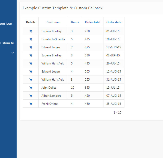
Main report (view#2)
Now your report is similar to report in demo application and you are almost ready to configure the plugin to use boostrap popover functionality.
Before implementing the plugin, we need bootstrap CSS styles and JavaScript library to use popover in APEX application. You can download files from bootstrap (v3.3.7) download page or download already prepared files from here.
If you have decided to download files from bootstrap repository be aware that, the bootstrap CSS styles may override your Universal Theme CSS rules with redundant styles. You need to manually cut redundant styles, so it won’t change UT appearance – prepared files are free of this issue.
After importing bootstrap.min.js and bootstrap.min.css files (as application files) you need to include those files in the application, so the application can use them.
You can do it:
No matter where you want to include files you have to use #APP_IMAGES# substitution string as prefix for files:
|
1
|
#APP_IMAGES#bootstrap.min.js
|
and
|
1
|
#APP_IMAGES#bootstrap.css
|
After doing it, your application is ready to invoke popovers on DOM elements within your application.
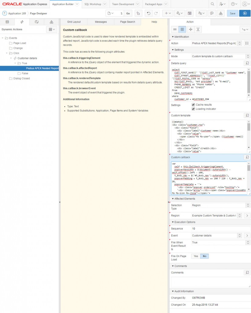
Clicking on cell in column “Customer” should fetch selected customer data and present it as popover. To do so, you need to create Dynamic Action with “True” action that will trigger the plugin.
| Name | Customer details |
| Event | Click |
| Selection Type | jQuery Selector |
| jQuery Selector | td[headers=CUSTOMER] |
| Condition | none |
| Event scope | Dynamic |
| Static Container (jQuery Selector) | #CUSTOMER_ORDERS |
| Attribute | Value | ||
| Settings | |||
| Action | Pretius APEX Nested Reports [Plug-In] | ||
| Mode | Custom template & custom callback | ||
| Details query |
|
||
| Settings | [x] Cache results[x] Loading indicator | ||
| Custom template |
|
||
| Custom callback |
|
||
| Affected Elements | |||
| Selection Type | Region | ||
| Region | Custom callback | ||
| Execution Options | |||
| Fire On Page Load | No | ||
Save and run the page. After clicking on cell in column “Customer” you will see unstyled popover.
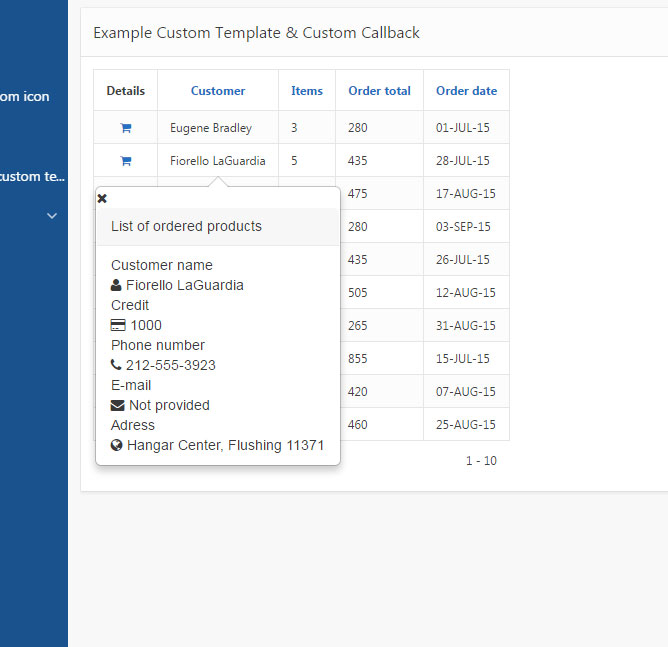
Main report (view#3) – popover with custom template
The popover pops out but we are missing some styles for Custom template and JavaScript listener for close button added in popover.
In page designer:
|
1
2
3
4
|
$(document).on(‘click’, ‘.popoverCloseBtn’, function(){
$(this).closest(‘.popover’).popover(‘hide’);
$(‘.hasPopover’).removeClass(‘hasPopover detailsShown’);
});
|
|
1
2
3
4
5
6
7
8
9
10
11
12
13
14
15
16
17
18
19
20
21
22
23
24
25
26
27
28
29
30
31
32
|
td[headers=”CUSTOMER”] {
cursor: pointer;
}
/* custom template */
.popover-content .field {
margin-left: 10px;
padding: 5px;
display: block;
}
.popover-content .label {
font-weight: bold;
}
.popover-content .value {
line-height:30px;
}
/* popover */
.popover.orderList {
max-width: 315px;
min-width: 315px;
}
.popover-content {
max-height:400px;
overflow: auto;
}
span.popoverCloseBtn {
position: absolute;
right: 10px;
top: 10px;
cursor: pointer;
}
|
Save and run the page to see how the final result looks like. You should end up with fully styled popover and custom template like the one in the image.
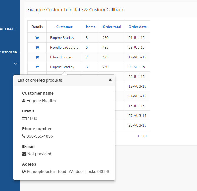
Main report (view#4)
Clicking cell in column “Customer” displays customer details as popover. Each click on cell pops out new popover and popovers could be closed after clicking “X” button.
I hope this article was useful. I will be thankful if you provide feedback on the GitHub.
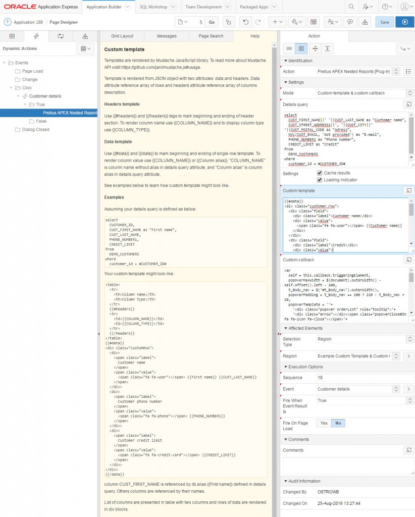
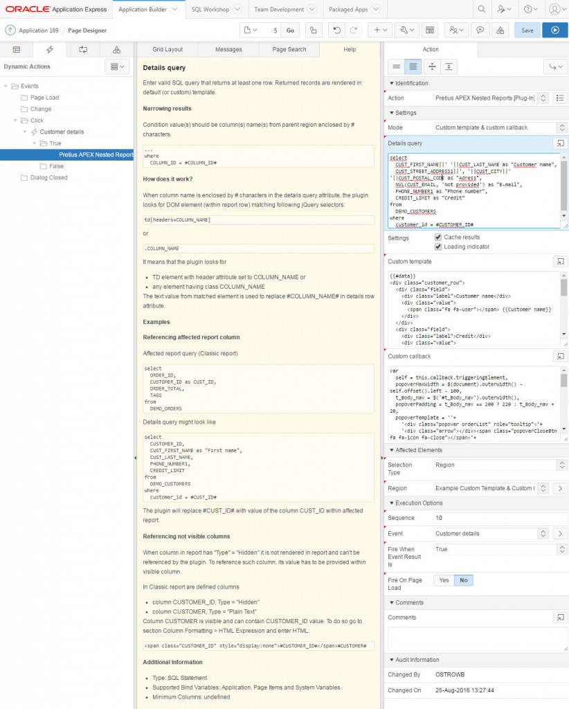
Ps. If you have any question remember that the plugin contains detailed help within APEX application builder:


